5. Typography for Your Magazine Layouts
Step 1
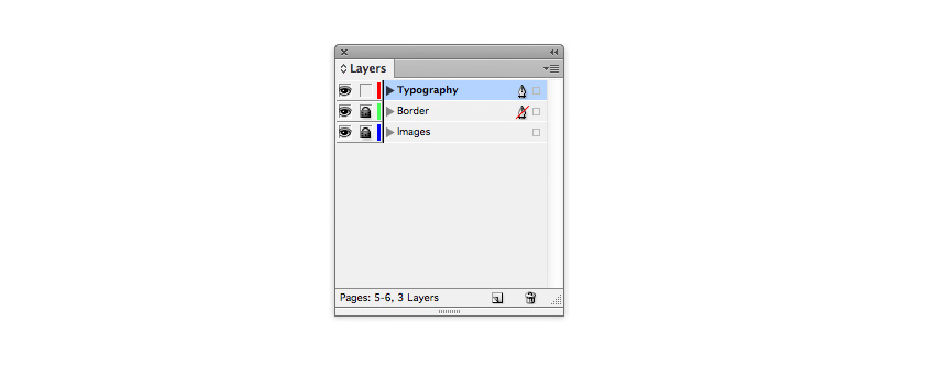
Go to the Layers panel and Lock the Image layer. Unlock the Typography layer.
Step 2
We’ve already used Adobe Garamond Pro for the running headers and page numbers, so we can continue to use this for the main text of the article. However, you can introduce one, or even two, more typeface(s) to use for a more exciting title, and to use across the document for quotes and other decorative text elements.
Futura Std is a clean, minimal font which will give an extra stylish, modern edge to a fashion magazine layout. But any sans serif with an optional condensed weight would be a good pick too.
To add a fun touch, you can also install Sail, which has a more playful feel.
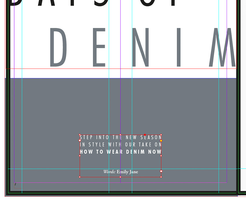
Navigate to Page 1 of your document and use the Type Tool (T) to create a text frame 214 mm in Width and 94 mm in Height. Type ‘Days of (paragraph break) Denim’ and set the Font to Futura Std Light Condensed, and the text to All Caps.
Highlight ‘Days of’ alone and set the Size to 122 pt. Increase the Tracking, from the Character Formatting Controls panel at the top of the screen, to 230.
Highlight ‘Denim’ alone and increase the Size to 135 pt, Leading to 160 pt and Tracking to 430. Set the text to Align Right and alter the Font Color to the grey‑blue swatch, C=56 M=41 Y=37 K=20.
Position the text frame just above the center of the page, as shown.

Step 3
Introduce a second smaller text frame (about 75 mm in Width) on Page 1, positioning it centrally towards the bottom of the page. Here you can type in a short summary of the article, setting the Font to Futura Std Light Condensed, Size 14 pt, All Caps, Font Color to [Paper] and text alignment to Justified (All Lines).
Set the ‘Name’ of the article’s author below the summary, in Adobe Garamond Pro.
Step 4
Create a third text frame on Page 1, about 170 mm in Width. Position it centrally on the page, at the top of the grey frame.
Type ‘Dreaming’ and set the Font to Sail, Size 112 pt, and Font Colour to [Paper]. With the Selection Tool (V, Escape) active, hover your cursor over the bottom right corner of the frame and rotate it upwards a little to give the text a slight slant.

Step 5
Navigate down to the second spread of the document, focussing on Page 3.
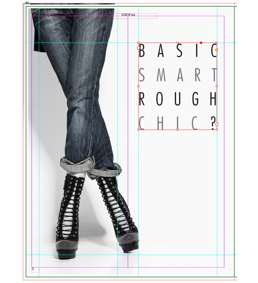
Use the Type Tool (T) to create a square text frame, and position it between the guides marking out the right-hand half of the page. Rest the top edge of the frame on the top horizontal guide, as shown below.
Type an introductory sub-title of four five-character words. Here, I’ve gone for ‘Basic Smart Rough Chic?’, positioning each word on a new line.
Set the Font to Futura Std Light Condensed, Size 50 pt, Leading 70 pt, All Caps and Justify All Lines. Increase the Tracking to 600 and highlight individual parts of the text, setting them in a different color, C=56 M=41 Y=37 K=20.