UX/UI DESIGN BRIEF #8
Redesigning the Spotify App
A step-by-step project guide: research a real user problem, map the user flow, use the existing UI/UX Style Guide template, design your screens, and build and test an interactive prototype.
The Project
Your challenge is to redesign a focused part of Spotify’s mobile music experience. Make the experience easier to navigate, more personal, and more useful for a specific audience. Do not try to redesign every feature. Identify one meaningful user problem and build a connected experience that addresses it.
User Flow
Map the journey and key decisions in FigJam.
UI/UX Style Guide
Duplicate and complete the existing class template.
Flat Screens
Design the required screens in Figma Design.
Interactive Prototype
Connect the journey and refine it with Figma Make.
User Testing
Test, revise, and test again with users.
Client Brief: Spotify
Objective
Improve the mobile music-streaming experience by helping users onboard, discover music, create playlists, and quickly access favorite songs. Your redesign should address a specific pain point supported by your research and testing.
Target audiences
Marcus Lee, 35 — Musician: wants to share music, collaborate with other artists, and get feedback on his work.
Sophia Patel, 23 — Music Enthusiast: wants to discover artists, create playlists for different moods, and find live music and concerts.
Sandra Jenkins, 28 — Fitness Enthusiast: wants to find motivating workout music, create exercise playlists, and quickly access music that fits her routine.
Requirements to consider
- Clear, easy-to-use navigation.
- Personalized music recommendations.
- Creating and saving playlists.
- Offline listening as a consideration in the experience.
- Sharing music or playlists with others.
- Discovering concerts or ticket information.
You do not have to add every feature. Use user research to choose the most important problem and keep your prototype focused.
01 — Research the Existing Experience
Before redesigning Spotify, examine how the current app works. Ask at least a few people about how they discover music, find saved songs, manage playlists, or listen while exercising. Observe the current app and note moments of confusion, extra steps, or unmet needs.
- Identify one recurring user problem.
- Record what users currently do and where they struggle.
- Look at competing services such as YouTube Music, Apple Music, and Pandora for useful interface ideas.
- Write a short problem statement and a “How might we…” question.
02 — Create Your User Flow in FigJam
Before designing screens, choose one task for your Spotify user. Map the starting point, the actions and decisions along the way, and what success looks like. Your flow should describe the logic of the experience—not just show a row of finished app screens.
- The starting point and the user’s goal.
- The sequence of actions and screens.
- Decisions and alternative paths.
- Relevant error, empty, or recovery paths.
- The successful completion of the task.
Use the course template. Open the AMDE 477 FigJam User Flow Template, duplicate it, and adapt the structure to your chosen Spotify task. Keep the flow focused and make the labels easy to follow.
Open the AMDE 477 FigJam User Flow Template →
Deliverable: A clearly labeled FigJam user flow and a brief explanation of the user problem and why you organized the journey this way.
Review: The Project Process in Figma/FigJam: User Flow, Low-Fidelity and High-Fidelity Prototyping.
03 — Complete the Existing UI/UX Style Guide Template
Use the existing Student UI/UX Style Guide template created for this course. Open the template, duplicate it, and adapt its sections to your Spotify redesign. Do not create a different style-guide format.
Open the Student UI/UX Style Guide template in Figma →

Color and contrast
Define your color palette and explain the role of each color. You may draw inspiration from Spotify’s identity, but make purposeful choices that support readability and your own design direction.

Typography and spacing
Establish a consistent hierarchy for headings, body text, labels, and supporting text. Choose spacing values and apply them consistently across your screens.

Reusable components and states
Document recurring elements such as buttons, search fields, playlist cards, navigation, and playback controls. Show relevant states such as default, selected, disabled, or error where appropriate. Include accessibility considerations such as contrast, legible text, clear labels, and visible focus.

Deliverable: A completed copy of the existing UI/UX Style Guide template adapted to your Spotify project. Keep it open as a reference while designing screens.
04 — Design the Flat Screens in Figma Design
Use your user flow and style guide to design the key screens in Figma Design first. Keep the screens organized and name each frame clearly. You should be able to see the visual design before you ask Figma Make to help create the interactive experience.
Your screen set should include the screens needed for your chosen flow. The brief identifies these core screen types:
- Onboarding: welcome and preference setup for a new user, if relevant to your flow.
- Home: personalized recommendations and quick access to useful content.
- Search: search for songs, artists, albums, or playlists.
- Playlist: view, create, save, or edit a playlist.
- Player: current track, playback controls, and relevant actions such as saving or sharing.
- Settings or preferences: music interests and personalization controls, if needed for your flow.
You do not have to design every possible screen if it does not support your chosen task. Include enough connected screens to demonstrate the full journey and any important decision or recovery states.
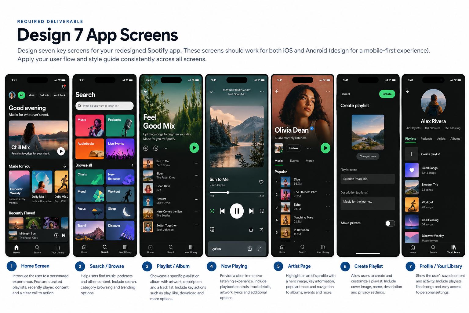
Deliverable: A clearly named set of flat screen designs in Figma Design that follows your user flow and applies the rules from your style guide.
05 — Use Figma Make to Build the Interactive Prototype
Once your user flow, style guide, and flat screens are ready, use Figma Make to help turn the planned experience into a working prototype. Give it a clear description of the user, goal, screen sequence, visual rules, and expected interactions. Your design decisions should guide the tool—not the other way around.
Finish the design
Complete the FigJam user flow, course style-guide template, and flat screens in Figma Design.
Describe the experience
Explain the user goal, key screens, visual system, navigation, and interactions.
Review and correct
Compare the result with your flat screens and style guide. Fix inconsistent visuals and broken interactions.
Prototype refresher video
Review this official Figma tutorial on using Figma Make to develop and refine an interactive experience. Use it as a refresher after you have designed your key screens and completed the style guide.
Intro to Figma Make
If the video does not appear, watch the tutorial directly on YouTube.
Your prototype should have a clear starting point, working navigation for the main journey, meaningful responses to user actions, and relevant success, empty, or error states. Preview it from beginning to end before testing.
06 — Test, Revise, and Test Again
Test your early wireframes or prototype with five people. Give each person a realistic task without explaining every step. Observe where they hesitate, make mistakes, or misunderstand a control. Ask what they would improve and request an overall rating using the same scale for everyone.
- Round 1: Test with five people and record observations, comments, and ratings.
- Identify the most important usability issues; prioritize changes that prevent task completion or cause confusion.
- Revise your flow, screens, and prototype based on the evidence.
- Round 2: Test the revised design with five people. Use the same tasks and rating scale so you can compare results.
- Report what changed and whether the second round improved the experience. If it did not, explain what you would revise next.

What to report
- The task each participant attempted.
- Patterns you observed across participants.
- The most important changes you made after the first round.
- Ratings before and after iteration, using the same scale.
- What you learned and what you would improve next.
Final Deliverables Checklist
- Research notes and a clearly defined user problem.
- FigJam user flow with decisions and recovery paths.
- Completed copy of the existing Student UI/UX Style Guide template.
- Organized flat screens designed in Figma Design.
- Interactive prototype created with Figma Make, with a working main journey.
- Short explanation of design decisions and key interactions.
- First usability test with five people and documented findings.
- Revised design and second test with five people.
- Brief summary of iterations and testing results.
- Shareable links to your FigJam, Figma Design, and prototype, with appropriate viewing permissions.
Remember the Process
Strong UI/UX work is more than attractive screens. Research helps you choose the right problem, the user flow organizes the journey, the style guide keeps the interface consistent, the prototype demonstrates behavior, and testing shows what needs to improve.